Which Makes Sense: A Brand Refresh or Rebrand?

In the world of branding, logo design, and visual identity there’s often confusion around the idea of rebranding a company or refreshing a company’s current brand. While a refresh and rebrand can both help a company stay current and relevant, there are significant differences and strategies to each approach.
Benefits of a Brand Refresh
Most successful and well-established companies go through periodic brand refreshes. These often result from a need to better relate to a changing audience or shifting market, or better reflect the company’s current product or service offerings.
Just a few well-known examples today are Starbucks, Google, and Dunkin, but the list of major brands that continue to evolve goes on and on.
Just like these major brands, a successful visual refresh builds on the equity you’ve worked hard to establish in your current brand. Your positioning statement, messaging, and brand strategy are all in alignment. You’re not planning to enter new markets or significantly change your products or services. But your current logo, color palette, and design system all need some new clarity and focus. A refreshed brand will remain recognizable to your existing customer base and should help position you as a current, forward-thinking company who’s aware of its evolving relationship with its customers.
Following is an example of a Scheffey brand refresh:
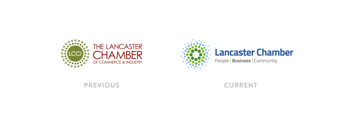 The Lancaster Chamber had a well-established brand but was going through some transitions of their service model, not to mention moving to a new location downtown. They felt that a brand refresh was needed as a new visual platform to launch their new service model. Our design uses a similar-looking icon, but one with a more organic feel that has more movement, along with brighter, fresher colors. A new, clean font was also used in cap and lowercase to convey a more friendly, approachable organization.
Benefits of a Complete Rebrand
While a rebrand also involves creating a new look, it’s more of a complete overhaul or transformation of an existing brand. It may be accompanied by a name change. The idea of retaining visual equity isn’t as compelling and there may be a deliberate reason to differentiate. Your current brand may no longer align with where your company stands today. A rebrand is a way to change your customer’s perception of who you are. And often it takes a far greater commitment in strategy, funding, and resources to make it truly successful.
Following is an example of a Scheffey rebrand:
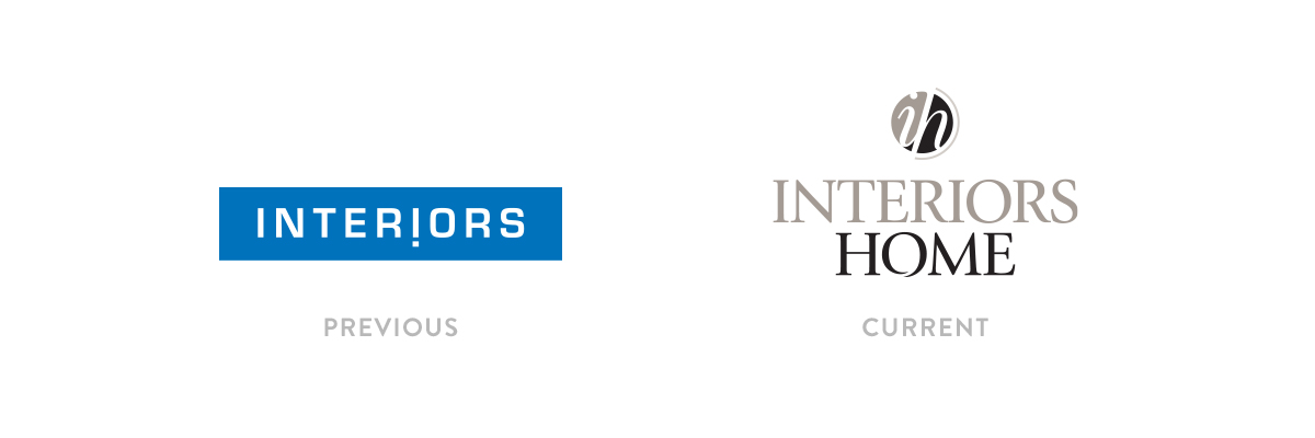 Interiors Home is a full-service home furnishings and interior design retailer. Since opening their doors in 1969 under the name Interiors 2000, the company not only added an additional location, but they also evolved into a much different type of shopping experience for its customers. The name and brand were changed to simply Interiors in 2003 (above). The reason for the name change to Interiors Home was, in part, to be more reflective of the products and services they offer today, to remain approachable but with a higher-end feel, and to convey a more classic look, which captures the ambiance of their stores.
The icon uses a classic italic serif font reversed out of a split circular shape, along with a modified serif font in the name. The color palette suggests a higher-end, architectural feel, reflective of what you’ll experience in-store.
Consistency is Key
As with any new brand, rebrand, or brand refresh, its visual effectiveness is dependent on successfully implementing it across all facets of your marketing. Website, signage, trade shows, email signatures, literature, the imprinted pens you give away … consistency across all channels is key.
If you’re considering a fresh take on your current brand but aren’t sure where to begin, take a look at some of the brands and logos we have redesigned or refreshed accourding to our clients’ needs. Then, visit our contact page and call or email us. We’d love to talk to you.
